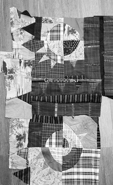
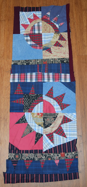
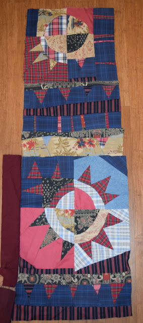
Using black and white versions of my photos has helped me to figure out that if I use plenty of my light beige fabrics and the shirt with red and white plaid, I can build in more contrast without too much of a problem. I made a line of triangles with a beige background instead of the dark blue - see how much better that is?
And here's a chunk where I have started to add in the plaidI've got quite a few of these bits now: one bauble and some strips. I'm playing around with different layouts but nothing is decided yet. They look like they are stitched together, but as yet they just sit on top of each other while I see what I like.This one has some of the beige triangles. I think that they look a bit lost in this photo, actually, but am finding that they work well when I add more of them to an area.I am also wondering about adding in a few extra bits of the very dark red. Lots of possibilities still, but at least now I have some sense of a direction.


7 comments:
These bits are just plain fun! The plaids certainly liven it up!
I do like the very dark red. And it's really fun to see how much the prints show up in the black and white photo!
Using B&W photos shows the values well. The line of triangles looks like a meteorologist's cold front to me. Sunny with a chance of snow?
This is looking terrific. Got a lot going on with this one, lots of decisions.
I like the addition of touches of beige here Kaja, I also often swap to black and white on the camera to pick up changes with my quilts. Playtime is important I think and your pieces here are looking really good.
Great progress going on here and the black and white option is extremely useful when checking contrast!
Fun process, thanks for sharing.
Very interesting to follow your playtime. I like how you play with a sort of New York Beauty. Especially these lost or deplaced triangles. The dark red gives it a certain depth. Another favorit for me :-)
Post a Comment